Harvard Exhibition: Dispatches from the GSD – 75 years of design (Reprise)

Click to enlarge

Last week, during the Alumni Weekend at the Harvard Graduate School of Design, the exhibition “Dispatches from the GSD: 075 Years of Design” was officially inaugurated. In the GSD Website you can find all the information regarding the events that took place. For some more info and a few pics (including the stand where some of the cartoons from this blog are exhibited) you can scroll down or just click here.

…………………………………………………………………………………………………..

Some of the events were streamed live, and in youtube you can find videos of the reception toast by Harvard President Drew Faust, and of the looong Faculty & Student Pecha Kucha that took place as part of the 75th anniversary celebration. There’s also a short but nicely illustrated commentary on Harvard Magazine, and a brief at Peter Christensen’s site.
Published by klaustoon

Klaus is a frustrated cartoonist that lives in an old castle in Europe. In his other life he is also a frustrated architect and scholar who...

6 thoughts on “Harvard Exhibition: Dispatches from the GSD – 75 years of design (Reprise)

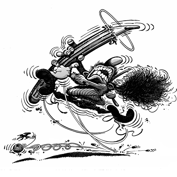
  1. I created my first business when I was 15. It was an art gallery named “Splat”. Of course, it consisted of only a logo drawn in Macromedia Freehand 7 (with a mouse, which was like performing heart surgery with a chainsaw) and an idea. By the name of the company you can probably infer that the logo looked a lot like this cartoon in a less-perfect kind of way. Mine had better typography, though, but I guess you didn’t have much control about that part 😉 . A year later I recycled it into the logo for a high school magazine that we published for some time.

    As usual, the cartoon is outstanding and remembering those naïve teenager times made me smile. Keep them coming.

    1. Thanks, Renato. I´m sure that your logo looked much better than you credit yourself for. Actually, this cartoon looks too much like many other things, first of all, some self-portraits by Francois Schuiten I´ve just cannibalized.
      Actually, now that I think of it, it´s kind of a cross-breeding between those ones and a self-portrait John Byrne did in his eponymous “The Art of…” where he showed his own head exploding. Heck, now that I think of it, even the explosion takes place on the same side in both…
      And unfortunately, I did have control of the typography. I´m just that bad…

      1. I can think of a reason why the explosion has to be to the right and not the left. It’s because, at least in a Western context, you kind of wish to convey that things are moving forward, and not backwards. That’s why it would feel weird if it exploded to the other side.

        As for cannibalizing, you’ve always been honest about your influences, so they fall into the category of flattery. You know, immitation bla, bla, bla… You do a hell of a job and I can say that you’ve shown uniqueness in your cartoons. And no, please don’t change the GSD logo typefaces. Heheh.

      2. Yes, I know it has to do with the left-to-right reading way of Western culture. It´s just that it made me realize how much these two drawings look alike (>sigh!<). Anyway, I´m glad these little games I do are still perceived as homages,and not blatant rip-offs. I really take a lot of pleasure in piling-up cross-references and multiple meanings in the cartoons, sometimes to the point of paroxism. Anyway, thanx for your kind words. I feel sorta weird posting these atemporal drawings that were done years ago in a different context. Glad someone enjoys them!

        Could you send me your logo design, btw? I´m feeling curious now.

  2. Fifteen years and about 5 computers later, I’m quite sure I don’t have the original files for the logo. Copies of the magazine might still be lying around somewhere in my mom’s house on the other side of the Atlantic Ocean. I’ll ask if someone can look for them and scan them.

    By the way, you know that I now live in a place called Groningen in Holland that has this Nederlands Stripmuseum (as in “Comic”, not “Tease”) that apparently was built based on ideas of Schuiten and I’ve never checked it out. I am by no means a connoisseur of the medium. I just enjoy your cartoons, but now that you pointed him out, I’m very curious.

    1. Ah, yes, the Nederlans Stripmuseum. I kind of remember that there were some concept design done by several comics book artists, Francois Schuiten and Henk Kuijpers among them. I remember some designs for the facades mimicking comic-book pages. If I remember correctly, Schuiten reused his concept of an open book, which he´s used in several occassions. But I´m writing from memory, so maybe I´m missremembering.

      On the other hand, there´s an actual structure in the Netherlands designed by a comic book artist, the theatre building (De Toneelschuur) in Haarlem, designed by Joost Swarte in collaboration with Mecanoo Architects.

Leave a Reply

Fill in your details below or click an icon to log in:

WordPress.com Logo

You are commenting using your WordPress.com account. Log Out /  Change )

Facebook photo

You are commenting using your Facebook account. Log Out /  Change )

Connecting to %s

%d bloggers like this: